New emotions on Facebook — brief analysis of their functionality and logic
For many years Facebook’s policy of singling out the “Like” as the sole reaction to any publication has been leaving people guessing as to why, why the option of a “Dislike” counterpart is being avoided and ignored. For most people this policy seems counterintuitive. After all, if I do not like the publication, I should be able to say “Ugh, I’m not interested in that sort of stuff!”
Facebook however, in a very adamant and staunch manner stack to their guns, and here’s why.
First, it greatly simplifies and accelerates the choice of action for the users. You don’t really have to think about anything. If you do not like — keep scrolling, and if you do — press that “Like”, period. Obviously, it’s much easier for visitors to interact with a simple interface.
Second — and this is far more important — by having only a “Like” button authors and consumers of content associate all publications exclusively with positive emotions. Basically, the absence of a negative assessment leads to extremely positive emotional connection with the service. “We have nothing bad here. We either have good or great stuff, that’s it!“. And it has always been a brilliant move on the part of Facebook.
The new “Reactions”
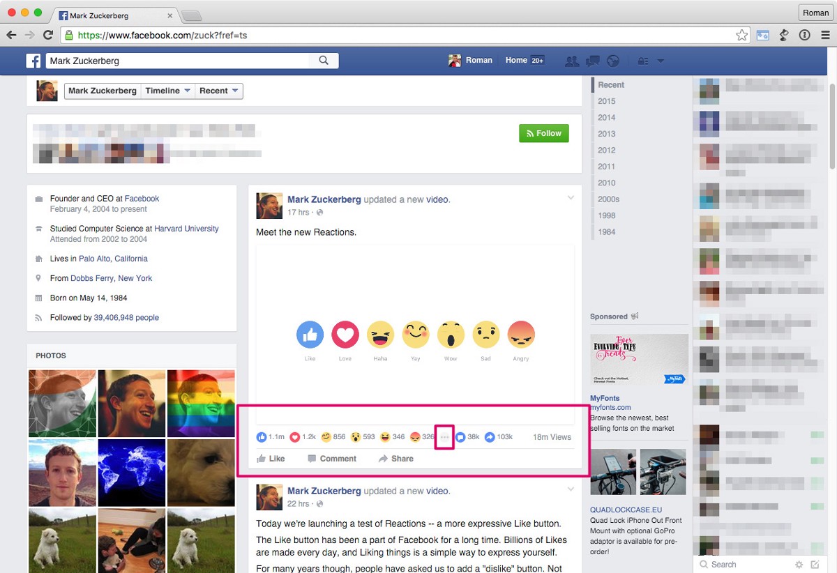
So now, on October 8 Mark Zuckerberg announced and began to integrate a wide palette of positive ratings into the interface. Move your mouse over the link “Like” on the main feed, and new emotions “Love / Haha / Yay / Wow / Sad / Angry” will appear.
Yet still no “Dislike” button.
At first glance this move seems quite strange and unjustified. Why this decision? It seems that Facebook is trying to move to a qualitatively new level of interaction with the users — to get into their heads and find out what they really think — for this a mere “Like” is not enough. Now Facebook wants to know what you feel, what emotions are going through you after having read a comment, and not only when you publish or share something. In fact, Facebook already began the implementation of this through its “What’s on your mind?” and “Add what you’re doing or feeling” functions.
All this is now called “Reactions” in general. This now allows for a very intimate and subtle interaction with the 1.44 billion (as of March 31, 2015) active worldwide users. And this kind of user data could theoretically be very useful to the same security services that are designing and executing information campaigns and wars around the world, not to mention of course the official sources of Facebook’s revenues in advertising through better targeting. As a trivial example: a user who has had a lot of “Sad” reactions on a given day might see an increase in advertisements for comedies.
Questionable points:
The hover delay for the mouseover is too long — about 1.5 seconds to activation. During this time the user is likely to lose focus on the action. The time between making a decision and its realization should be much faster on a huge social network like Facebook, where such actions happen a countless amount of time within a session.
After the list of alternative reactions pops up the option “Like” is visible in it as well. As a result, these two buttons with identical names and functions are spaced 20px apart from each other. This is pointless, because the user can already just click on the “Like” in its original text format — if that was the original decision — rather than do the same after hovering and accessing what is in essence a submenu.
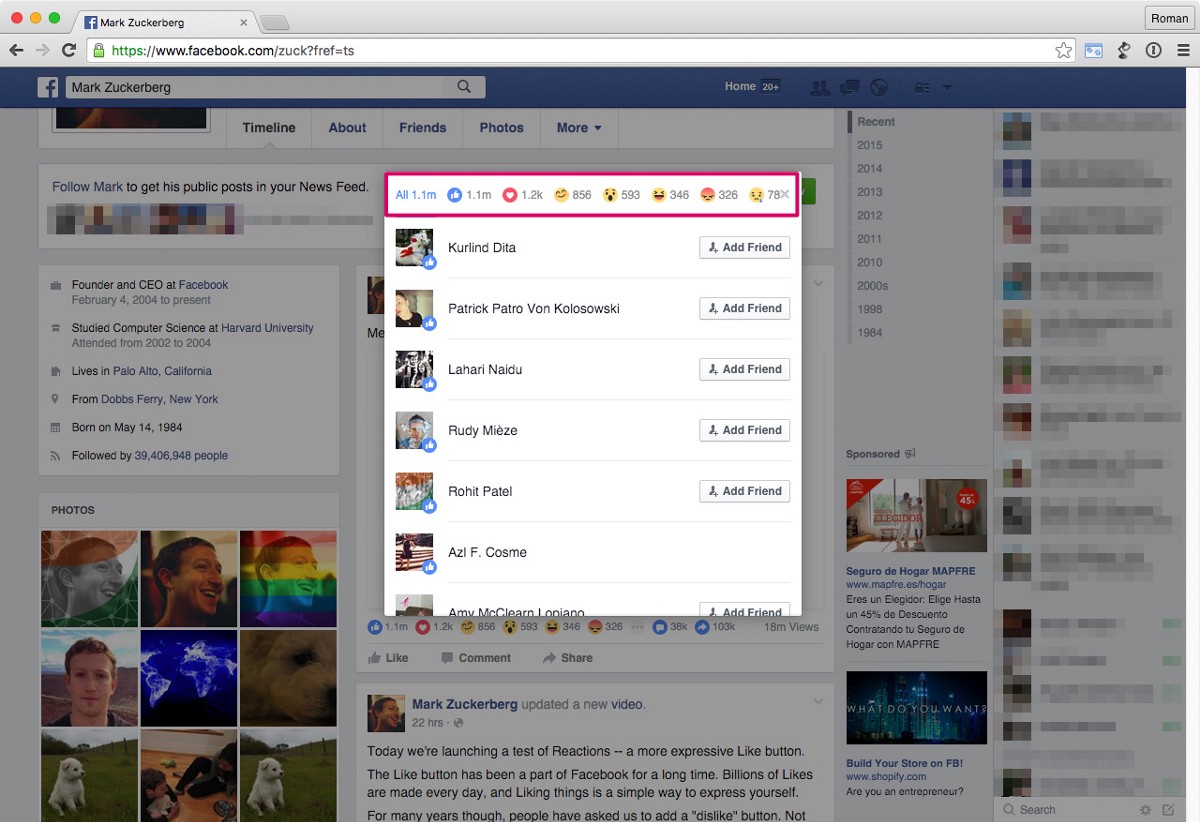
The ordering of the reactions “Love / Haha / Yay / Wow / Sad / Angry /// Shares /// Comments” under the message does not necessarily match the order in the menu when choosing the reactions themselves, which is just a trivial discrepancy. Their sequence in the submenu is fixed, while the one under the post is arranged according to popularity, or the amount of clicks it received, which again, adds slightly to the confusion.
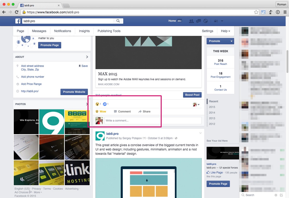
In addition, the series of reaction statistics under the post does not necessarily fit the width of the post itself, so when in that case the icon “…” appears, and you click it for additional information you might notice that the button “x” (to close the newly appeared window) can overlap with a portion of the reactions stats. This is just absurd for a company of this size and budget.
If you really want to display all the usage stats under the post, it would be logical to offer a shortcut and allow the user to click directly on the icons “Love / Haha / Yay etc.” already displayed under the post to add your voice, rather than having to go through the entire procedure of “Like” > hover > read options > select > click.
The introduction of a “Dislike” button on the part of Facebook is still under question. However currently the new reactions hidden under “Like” kill two birds with one stone. If the reactions are numerous — we see that it stirs something within people. If there isn’t a lot of them, we see that people do not care.
That’s all folks. <Emotion>Haha!</emotion>