The Faces of Tech
Keynotes galore! The ubiquitous tech keynote is all around us, with every major tech company having a go at convincing the world that their newest product is one to leave a path to trace for the next generations, a major footprint for all others to climb out of, and re-revolutionizing everything we knew (and then some) in a major display of hype and theatrical extravaganza.
Having recently started work at lab9.pro — a creative new-media agency — has provoked me to take a comparative glance at the major tech players and their product offers from the perspective of their visual presentation. And we can definitely spot some very different approaches in style as we try comparing Apples and Googles (and Teslas and Microsofts and Adobes) here.
Google — gears in motion
The first of the bunch with their I/O15 keynote back in May 28–29, Google’s presentation featured a rather impressive 360° screen and a highly mobile camera mounted under the roof to capture the events unfolding in all their panoramic glory. Or at least trying its best, being only able to look in one direction at once of course.
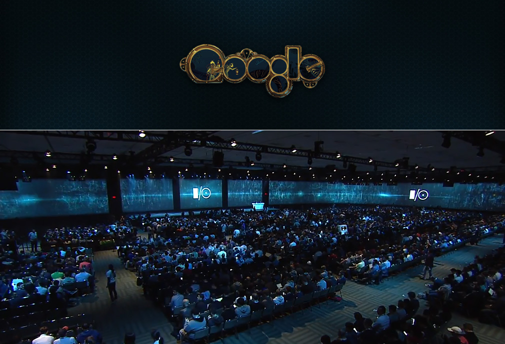
With the panoramic screen showcasing the “inside life” of technology — which apparently relies on giant gears and spinning clockworks — the setting lent a steampunk atmosphere to the whole event. The immersive theme seemed rather engulfing, and quite fitting with the general image that Google has come to be associated with — that of an experimental workshop of sorts, where tinkering is encouraged, and trial-and-error is the natural way of things. Perhaps no better project to showcase this mentality than Cardboard — the epitome of geekiness, encouraging users to build their own 3D VR headsets out of cardboard paper. Perhaps unrefined and rough around the edges, yet promoting amazing evolutionary technological advancement.
To be fair, Google’s own Material design glues together the experience firmly as well, lending the steampunk effects a more elegant quality and a futuristic shine, so that in the end the overall image is quite uniquely Google-esque.
Watch the whole Google I/O 2015 keynote on Youtube.
Apple — polished diamond
Rather famous for both keynotes and style, Apple’s presentation in September was aimed at keeping the best traditions of the tech giant’s appearance guidelines — the low-key, dark visual setting served to visually isolate and underline each product, and worked as a focal tool for the audience. The appearance of the speakers was also in line with this theme, where it almost seems as if all the male presenters conformed to a uniform — the only freedom of choice they allowed themselves in their attire was whether the single colour shirt they were wearing was hanging loose or tucked into their jeans.
The flow of the presentation went as usual — well-rehearsed, with few surprises (and no “one last thing”). As a notable exception one can mention that Apple decided to put the intro at the end, with a OneRepublic concert after the announcements stage.
All in all the dark, low-key visual tone was in tune with the presented line-up of improvements, with the focus on everything getting slightly bigger, thinner, longer lasting and more user-friendly, however without any real game-changers to announce. A departure from the usual routine was the appearance of several guest speakers at the event, with representatives from medtech companies, but also Adobe and even Microsoft present and presenting. This made possible for some interesting snapshots to be made.
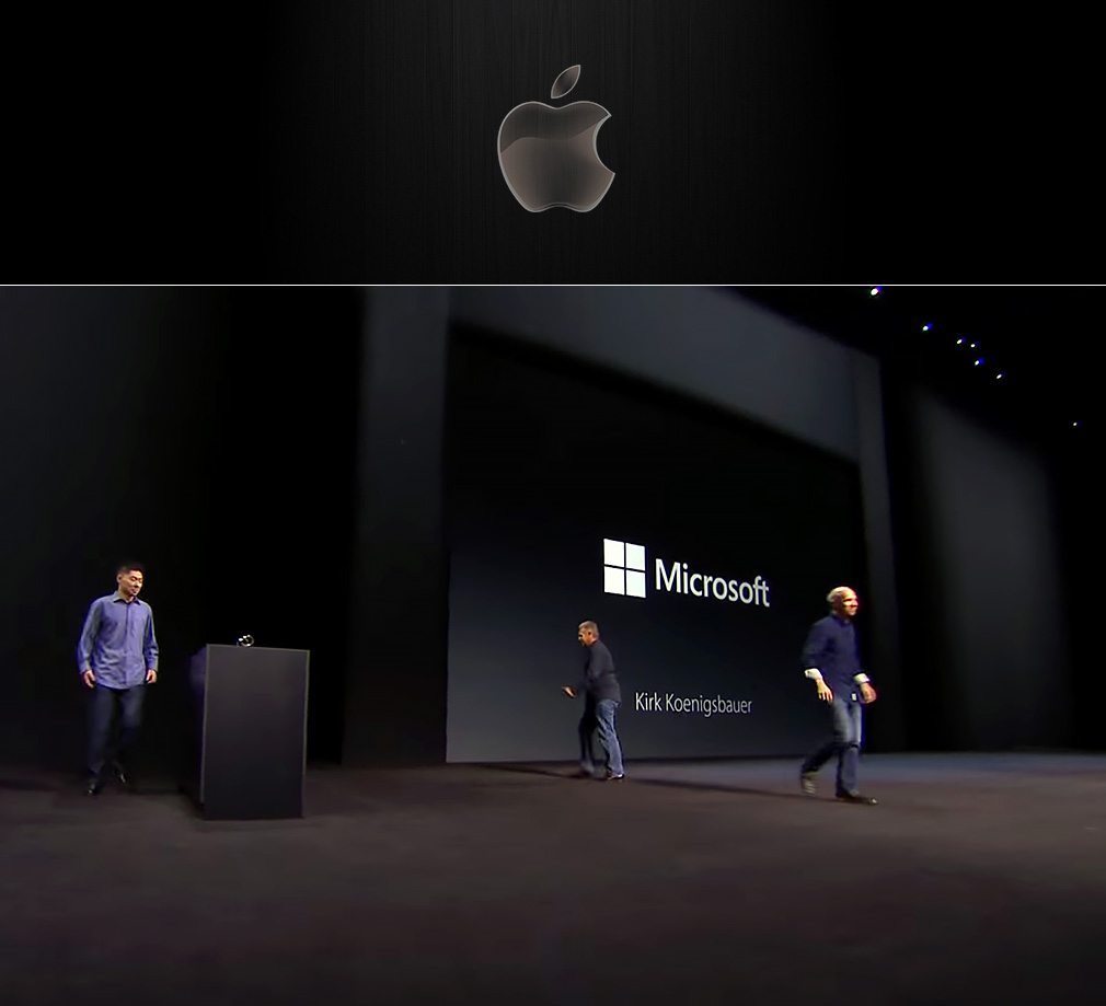
Overall the image of the event reminded that of a polished gemstone presented in a jewellery display case — stylish and glossy, appealing to the aesthetic sense, however with little to stir the imagination beyond the expected.
The Apple keynote in its entirety, including the OneRepublic concert.
Microsoft — friendly future
It’s not very often that you associate Microsoft with excitement and flair — a company known for its productivity, and famously associated with “the PC guy” from those Mac vs PC ads, but this year in October the tables were all turned.
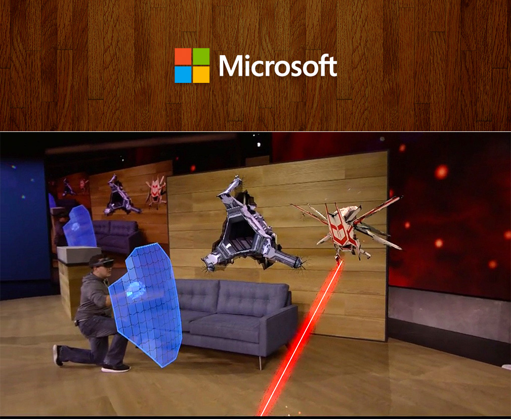
Microsoft’s Windows 10 devices briefing was dubbed “the best tech keynote of 2015” by CNet, and it’s easy to see why. The products demoed brought something new and exciting to an eager audience, and the overall atmosphere of the presentation seemed very friendly and direct. At the very least because Microsoft turned the stage into a living room to present the Hololens which grows more and more impressive every time it appears.
Daring to be bold, a departure from the usual corporate slogans was very welcome, as the presenters were not afraid to “be productive like a boss”, or wear fedoras on stage.
The sincere approach of the “living room” event was also underscored by humorous moments in the presentation, such as when the infamous toaster-fridge hybrid reared its head unexpectedly, taking even Panos Panay by surprise. Overall the feel of the keynote was light, friendly and straightforward, and the enthusiasm of the presenters felt right. Albeit not without episodes of grandeur, the event tried to be as human as possible, and I believe did a rather good job at it.
See how to save yourself from giant robots coming out of your walls here.
Tesla — cheerful geekery
Clearly the geekiest one of the bunch, Tesla’s Model X presentation on September 29th was filled with data, charts, comparison graphs and more data. It was also the shortest one, clocking in at just about 30 minutes. The message seemed to be “we don’t have time for this folks, we really need to get back to work after the presentation”.
The announcement itself featured little panache, with the star of the show — Tesla’s Model X — simply rolling out onto the stage in a “oh right, the car” moment, while Elon Musk was busy explaining a chart that was out on the screen. The camera didn’t even catch the action immediately, perhaps only noticing the car on stage after a loud reaction from the audience signified its arrival.
No overblown theatrics, no promises to “change everything we knew” about cars or otherwise — sometimes it’s better to let your product speak for itself. With humble tenor and geeky humor Elon presented their latest achievements relying on data and numbers, even throwing in some odd equations about the relation of force and distance — after all it’s just science folks.
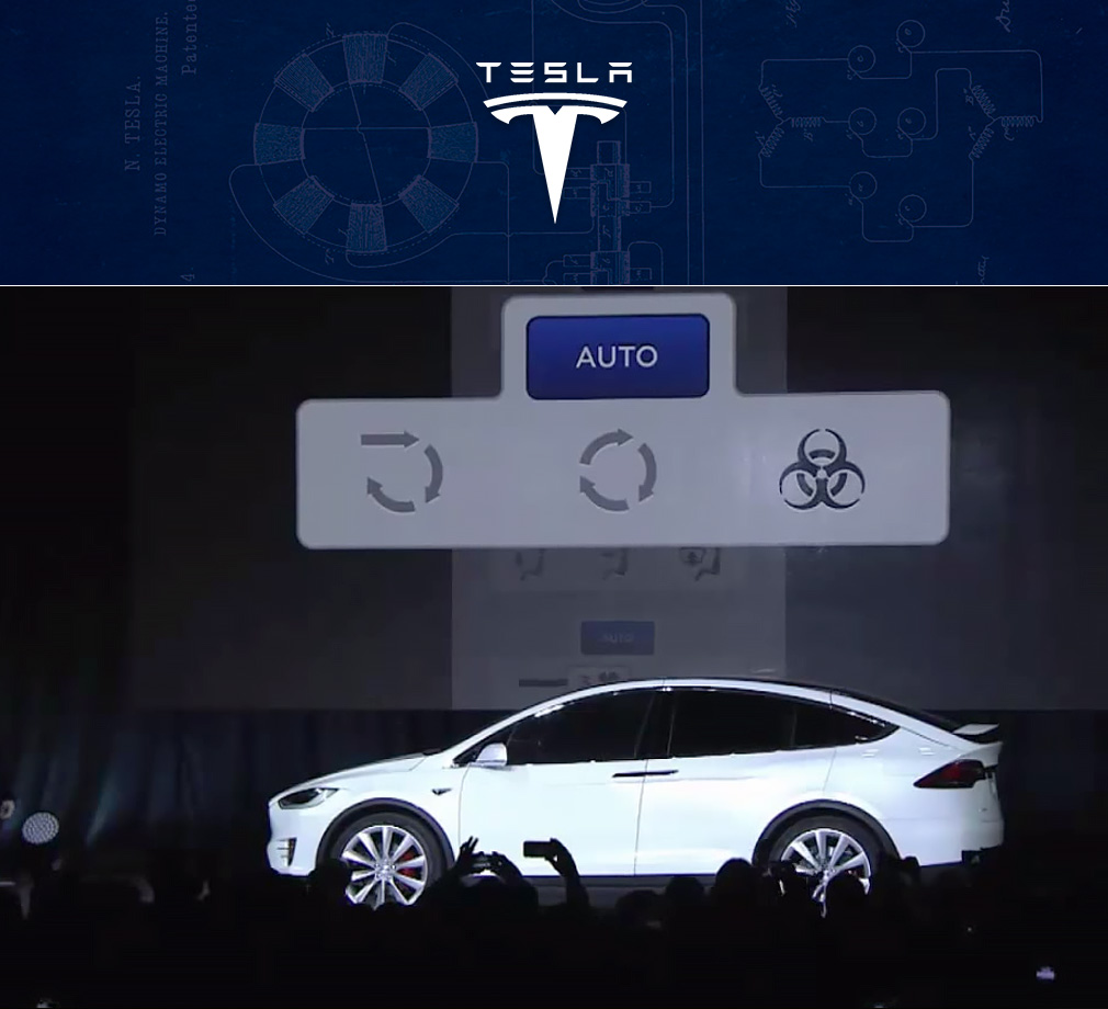
A great moment indicative of the keynote and Tesla’s approach in general was when the “bioweapon defense mode” button appeared, which elicited a lot of cheer and light hearted applause. Overall the event felt very positive and genuine — simple and geeky, yet in good taste.
Watch Tesla’s Model X roll out for the first time.
Adobe — splash of emotion
The Adobe Max keynote of 2015 happened over a few days in early October, and leave it to the guys behind a huge chunk of the world’s creative content to dazzle your senses in their presentation.
The opening sequence is fantastic in its visual form — a splash of color all over the stage, with funky 3D effects and dynamic transitions, underscored by a very upbeat tune composed and performed specially for the occasion by Opus Orange.
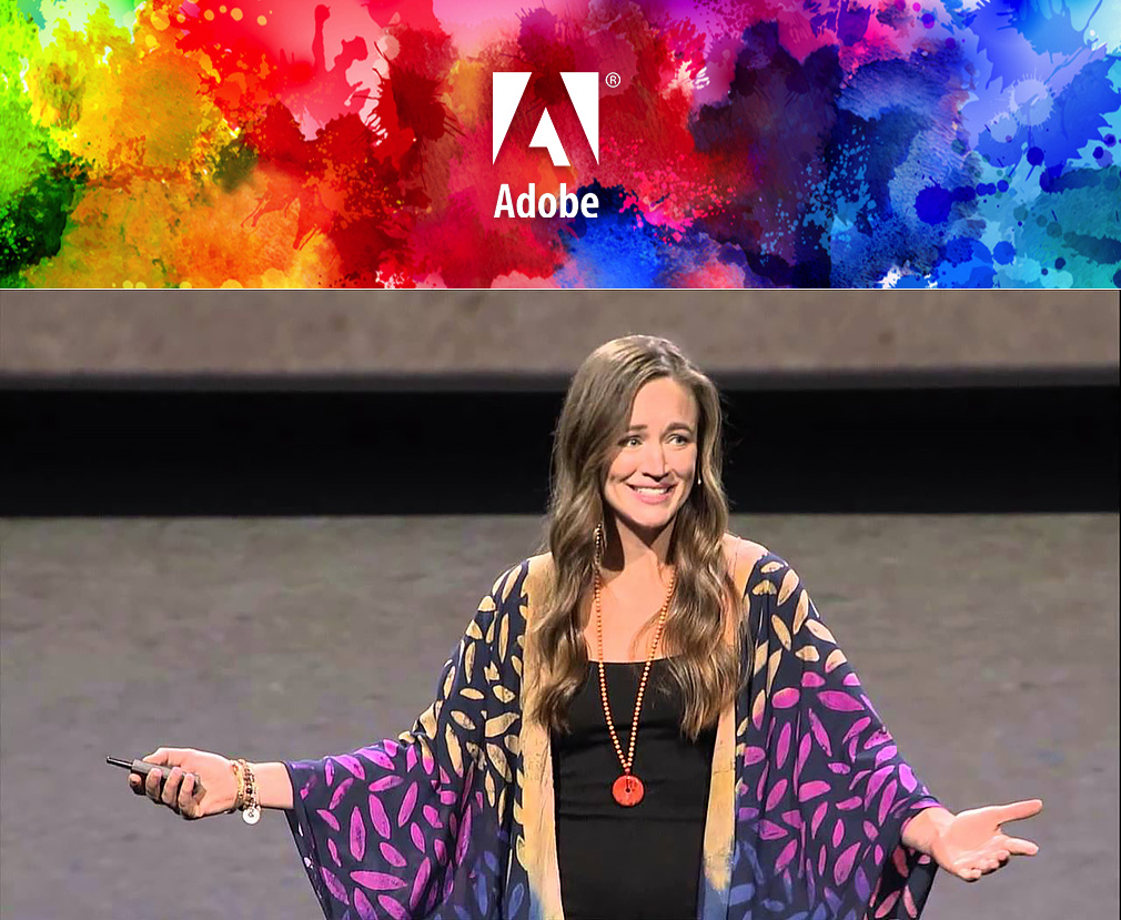
During the days of the event, which was the longest among all listed here the immersive stage was utilized to a great extent to feature very enthusiastic presenters and guest speakers. The walls, as well the floor and the ceiling of the stage all served as one seamless screen, changing dramatically to provide the narrative for each story, and emphasize the mood and atmosphere.
Together apart
With a plethora of different speakers of varying backgrounds in creative industries, sometimes the event felt more like a TED conference than a tech keynote. Of course, parts of the presentation were still quite “business-oriented”, focusing on the technological aspects and capabilities of the products, however other presenters and guest speakers were really putting on a performance on stage, adding a more personal touch to the story. Jason Levine’s wild enthusiasm, Elle Luna’s sentimental daydreaming or Baz Luhrmann’s unbridled flow of thought are but a few aspects worth mentioning that gave the event its emotional filling and charm, not unlike a theater performance.
You can see the full main event for yourself in two videos; part 1 and part 2.
At a time when all tech companies seem to try more and more to become one another at least when it comes to marketing or product development strategies, it is great to see how these individual styles in presentation differentiate them on stage. These events are a way for these highly influential entities to address the public and put forward an image of themselves, and it’s nice to see that each has their own idea and vision about that, with the execution on point as well.
And when it comes to global entertainment, these keynotes are really circus for the whole world in a sense, since technology is ubiquitous and these advancements are available to all of us. What more can a geek want? Here’s to a 2016 with more to come!
